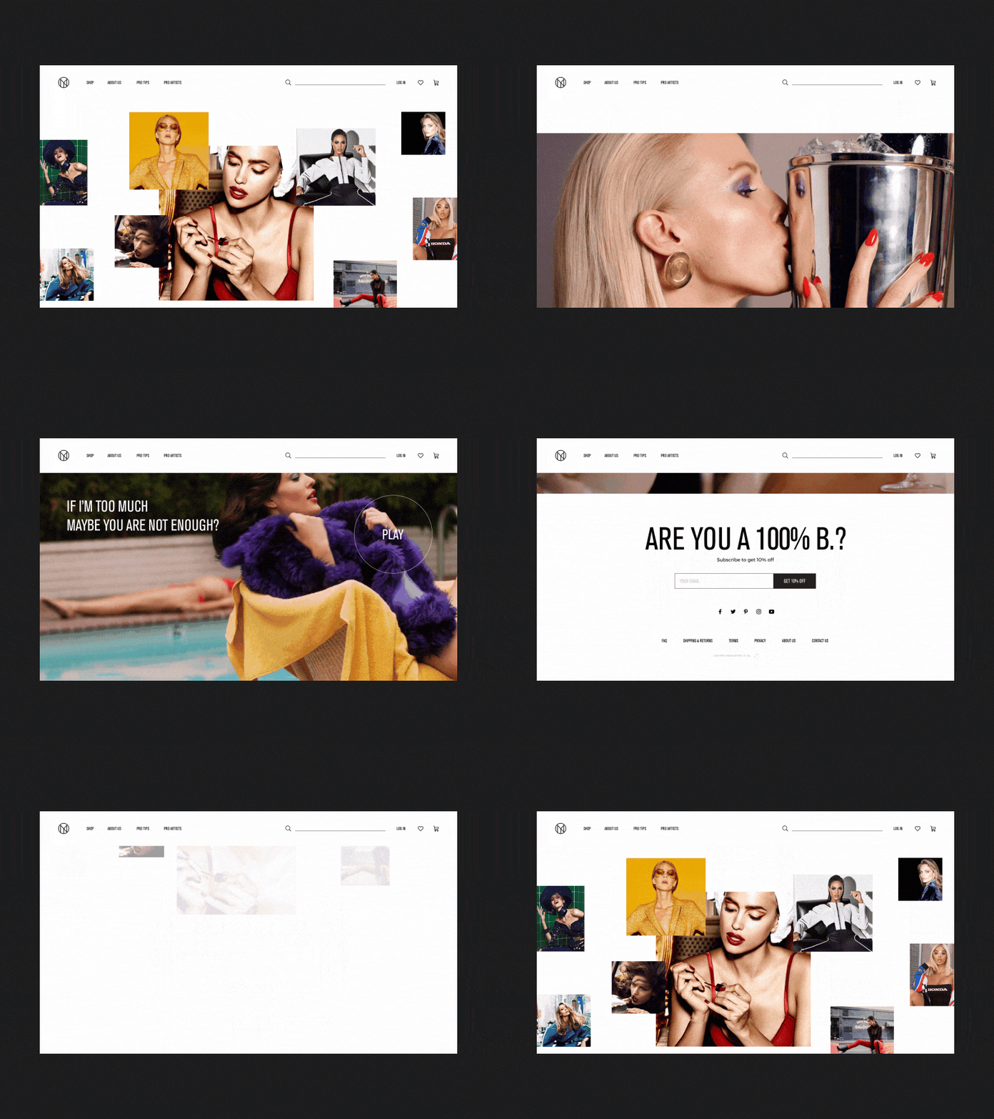
IL MAKIAGE Home Page Alternative Direction Animation
Friday friends,
This is the continuation of the second homepage direction, which I created when working on the redesign of IL MAKIAGE official website the soft launch of which took place a few weeks ago. The website would continuously be updated with new cool things and animations so remember to stay tuned :)
As I mentioned earlier, working on this project was a lot of fun! In order to learn more about the brand and its bold identity I even was invited to visit the headquarters and production facilities. This really helped to understand what the brand stands for — which is the uncompromising attention to detail, designed to capture the spirit of confident women everywhere.
So if you share the view that minimalism is dead, this is definitely the right brand for you! Make sure to check out their cool products :)
I am really eager to hear what do you think about this homepage direction. You feedback is always very appreciated.
Stay tuned for more inspirational projects from me and remember to spend a great weekend ;)
Cheers!
Press "L" to appreciate it

