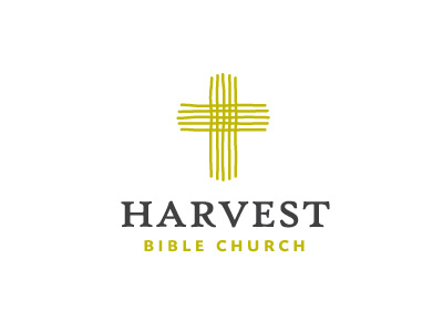
Harvest Bible Church Logo
Initial logo design idea/concept put forward for the Harvest Bible Church.
The main challenge was to somehow link in the notion of harvest with the uber symbolic cross whilst keeping this particular church logo free of the visual clichés that often accompany many church logos.
I was approached by the Harvest Bible Church after they had seen the general style of my existing logo portfolio so this was also a determining factor with the design style. A clean, smart, well defined design was what this client was seeking.
The idea you see is basically formed from the imperfect lines of a soon to be harvest field, but also draws on the idea of a recently ploughed field which sets the beginning and creation of the crop cycle.
The horizontal and vertical lines converge creating this square/hatched shape which provides for a meaningful link to that one place where people will ultimately converge: the church.
Currently the overall typography is pretty traditional. Big word on top, small words/tag line in a contrasting font underneath. This could well change during the projects development cycle, but for the moment provides a respectable foundation for which to work on the primary goal: the logo mark.
Updates to follow.


