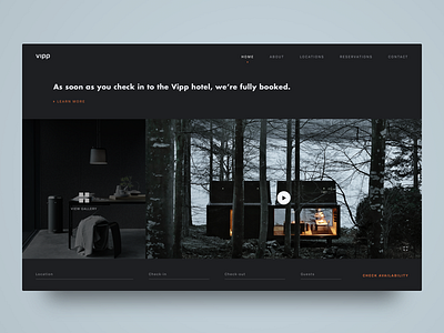
Dark UI Hotel Booking Page
I need your opinion. Which text field version of the form do you like better? This featured version or the new Material Design style in the attachment? I personally like the simple aesthetic of this style here but please let me know what you think in the comments.
Keeping with the dark UI here. Wanted to experiment with what the Vipp Hotel booking page would look like with a darker web interface since so many of their products are either black or white.
The idea here with the booking form at the bottom is that the form inputs would trigger a modal overlay where the info is selected (calendar dates, location, etc) for input. So no need for dropdown menus. I may upload the animated interactions process later this week.
This was purely for experimental purposes and is completely unsolicited.
Photos and logo are the work and property of the respective owners.


