Homepage Animation for a New Global Telecommunications Website
Hey there!
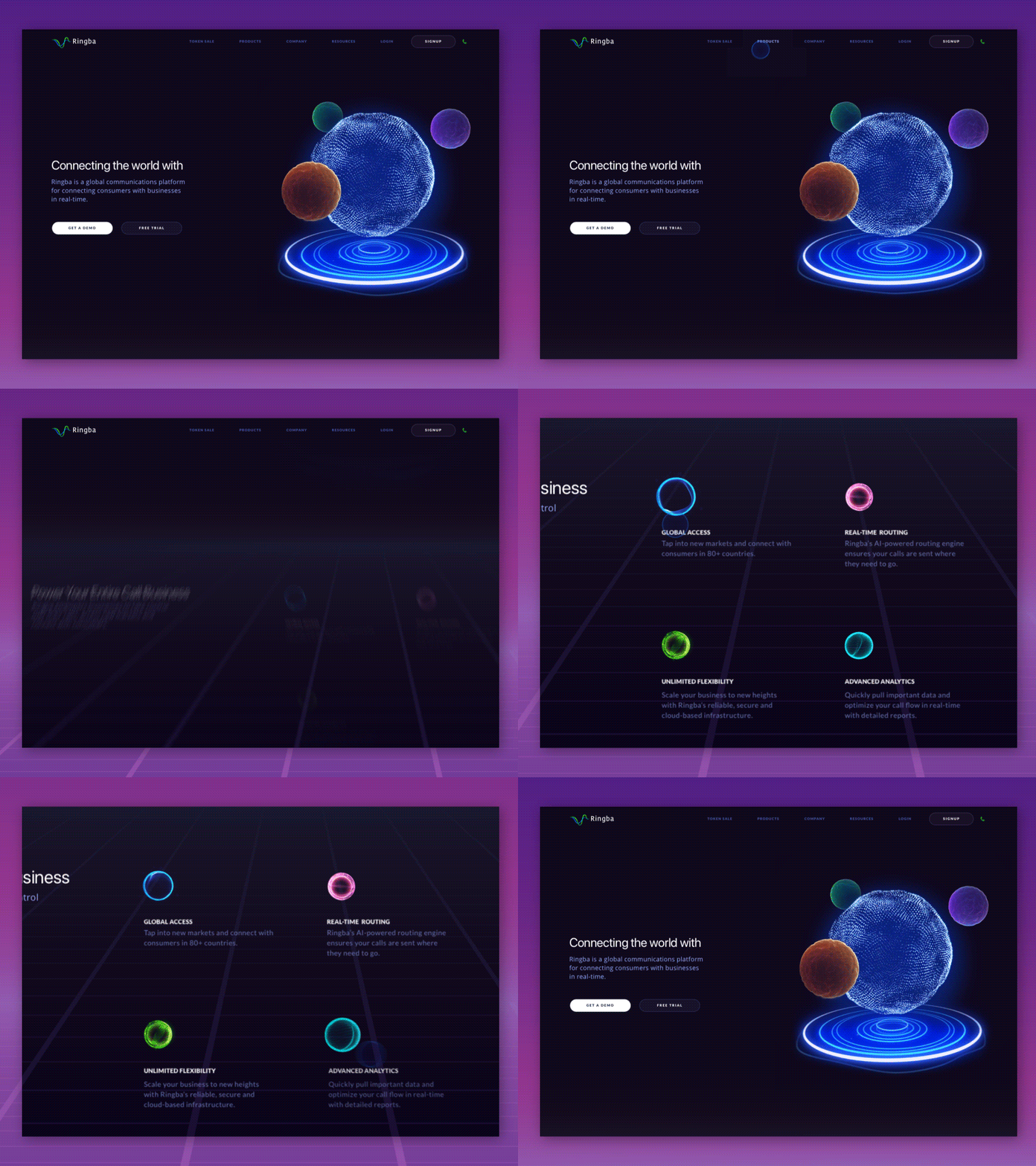
This is the animated version of Ringba’s homepage we created here at Zajno. This is WIP though, so if you have some advice to share - shoot!
Goals
Creating a non-standard telecommunication company website with an unconventional, futuristic design to reflect the product’s game-changing nature and push the limits of innovation further. We had to help relax potential clients’ jaw muscles (does this substitution of “jaw drop” work?) while still making sense of what the product is about for them, as well as targeting higher-class companies.
Approach
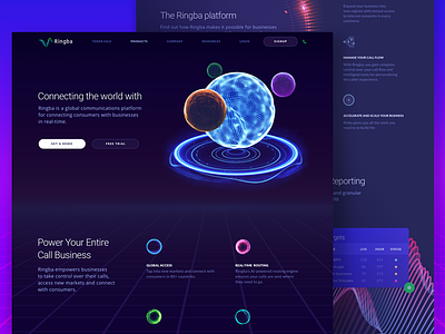
As our objective was to come up with a non-standard design solution, we said no to such typical ideas as using device mockups or any other design solutions that infest the Internet these days. We’re kind of sick of that. Instead, we decided to dig a bit deeper and present the product through a metaphor: the big shiny orb and its satellites, where the largest orb representing Ringba itself and satellites being Ringba’s add-on products: Call Tracking and Interactive Voice Response which you see above. We opted for dark color palette to go on with the space theme and also used waves to represent sound waves. And calling is about sound waves, right?
Results
We’d like to think that the design we came up with is futuristic, storytelling and intuitive. We see it as a digital outer-space world where Ringba, the biggest celestial body, and its satellites provide best quality communication for all its inhabitants. We helped the platform’s potential customers see that Ringba is not just an ordinary telecom solution for big and medium-sized companies, but an entire system that can completely change the way their businesses connect with consumers and take this communication to a whole new level!
This is WIP, so some feedback from you could be really helpful :)
Press "L" to show some love!
ᗈ Join our Newsletter!
ᗈ Website
ᗈ TheGrid
ᗈ Spotify
ᗈ Twitter
ᗈ Medium
ᗈ Facebook
ᗈ Instagram

