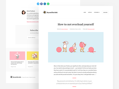
Minimalist blog concept
Excited to be launching a new blog and resource site soon, here is a sneak peek of the article page.
A big emphasis has gone on readability by using generous font-sizes, strong contrast ratios, and healthy line-heights. I've also tailored the paragraph width to hit around 12 words per line.
The hero illustrations are the work of the talented Scott Martin from @Burnt Toast Creative (shout out for letting me use them), it's a similar style that I'd like to adopt on the real site, the idea being that each article will have a unique related graphic to support the content. Better get learning...
More by Riot & Rebel View profile
Like

