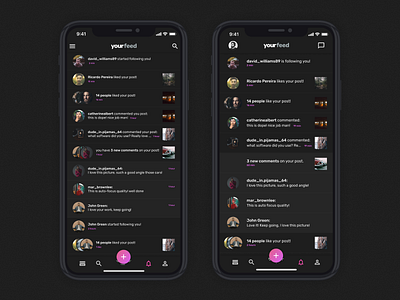
Day 31 - Notifications: Before/After
Now that I finished the 30 days challenge, I will take a look back and keep improving in places where I feel there is the need to do it.
One of them is the Notifications screen, I felt like the font was too small and the information was a mess. With some small adjustments you can see on the right the page with a cleaner look!
More by Miguel Freitas View profile
Like
