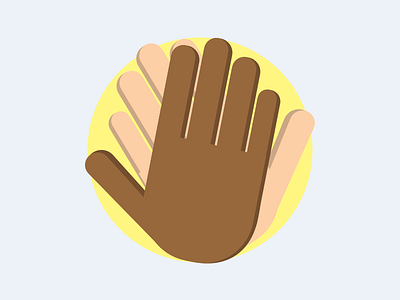
High Five!
Logo design for a project I'm working on.
Started with one hand, then cloned it and flipped it to create the "high five" motion.
Each hand is comprised of 6 base shapes (5 fingers + palm) which were copied, darkened and shifted over to create the shading
I went with soft colors for the background so as not to distract from the central design. The yellow circle is meant to further draw attention to the hands
The hands are meant to resemble my wife's and mine, which has the unintended benefit of providing great contrast. I don't think this design would work as well if both hands were the same color.
More by W. Bryan Jacobs View profile
Like
