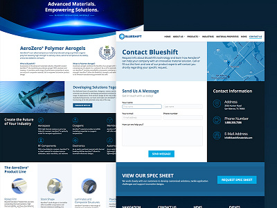
Blueshift Redesign
Pretty happy with the way this redesign came along for Blueshift. I got to make a lot of icons for words I honestly don't really understand, and really liked the direction I went with this site's contact page. Let me know what you think!
More by Paul Capetola View profile
Like
