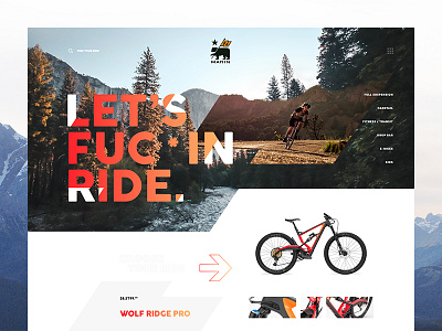
Let's F***in Ride.
One of the many reasons I love working with @Magnetic Creative - Creative Director @David Carrillo came up with a two week challenge and the whole team immediately hopped on board.
Every two weeks we pick the subject and are free to explore any sort of design. This was a homework assignment to do a quick design exploration. No site map or wireframes, rules or requirements, but spend a few hours and pump something out - outside of our busy work hours.
Ex 1 - Marin Bikes.
Squares become a default in my brain most times when beginning any design project. My main focus throughout this first exploration was simply to steer away from using squares everywhere. In the Marin logo I was drawn to the shape of the flag and decided that's what I was going to run with - creating angles throughout the layout. This allowed me to have some fun with image treatments and forcing some movement as you navigate down the page.
Check out the attachment for full pixels (as far as I got).
-
Searching for your True North? We would love to hear about how we can help. Email us hello@mag.cr
