Spotify App Redesign Concept AR
I want to introduce my concept of Spotify Music App for iOS.
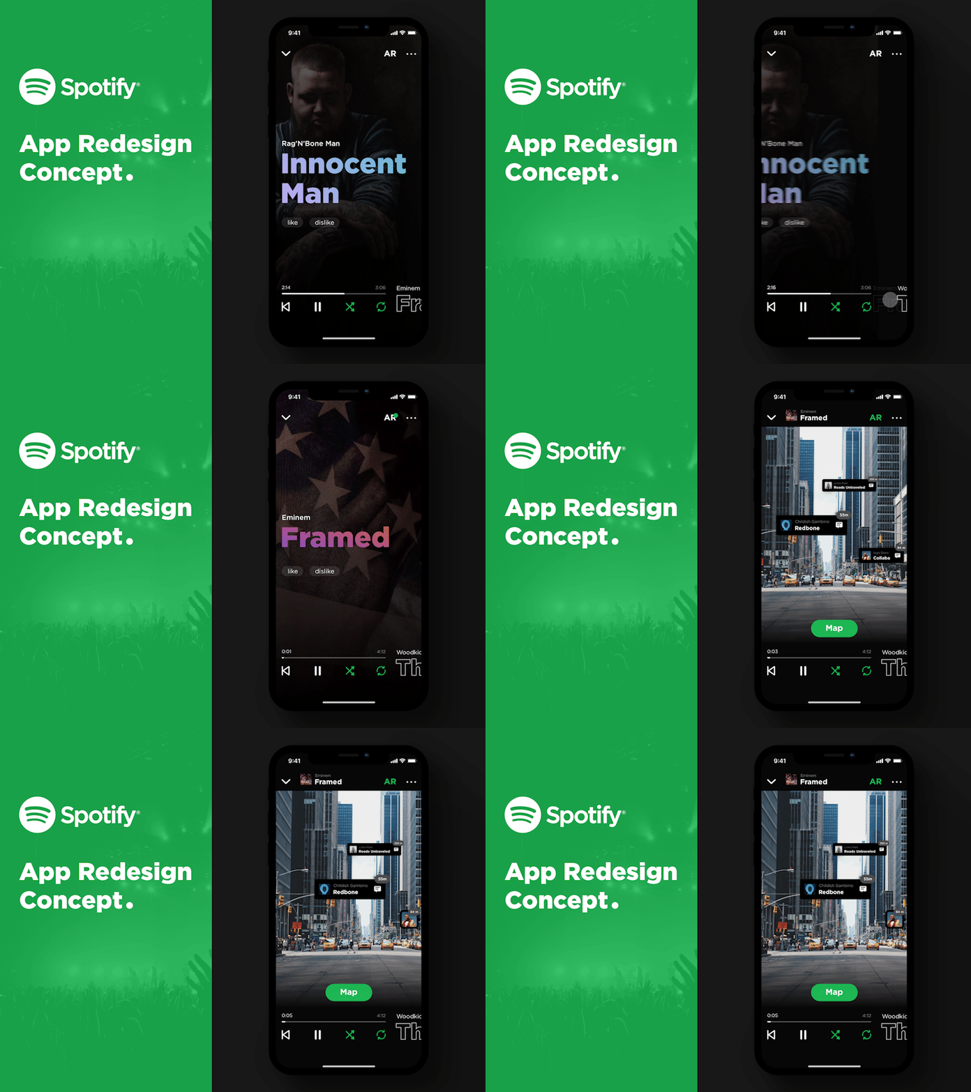
In this idea, I decided to concentrate on the presentation of music. The name of each musical composition takes up a large area on the screen and the text color is automatically taken from the color of the album cover. The cover is displayed full-screen.
The player at first glance is standard, but the difference is that we see which song will be next and when we swipe the name of composition we go to the next song.
The main difference from conventional music applications is that I added the concept of AR. It is interesting that if someone in the nearest environment listens to Spotify you, the application will notify you about this with notification icon and when the AR mode is activated, the camera will turn on and you will be able to see in real time what people are listening near you now. By the tap of the song, it immediately turns on in your player. By clicking on the message icon you can start a chat with a person and discuss your tastes in music, for example.
I invite you to my blog:
Instagram - @ajay__design
Telegram - t.me/ajay_design
