Showcase Concept: iOS App v1
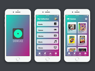
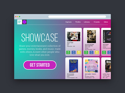
Further expanding the Showcase idea, I decided to do a quick hash out of what an iOS app might look like. I didn't go beyond a splash screen, a collection screen (which would be the home screen), and what one of the categories would look like.
My thought is that the Explore tab would show other users who have similar collections to you (maybe people with similar interests that you set in your profile, or people whose collections match yours by at least 40% or something).
The Friends tab would show a list of friends you have added where you can see their profiles and collections, initiate trades, and send direct messages. This would also be where you accept other friend requests.
The Inbox tab would be all of your direct messages, whether just chatting with friends, or any trades that have been initiated.
Hitting your profile picture on the Collections screen would take you to your own personal profile and account where you can view it, edit it, etc.
This is just an initial start, but I like the direction that it's heading and want to keep developing it. I would love to hear feedback on my ideas so far, so if you have any thoughts or criticisms, let me hear it!

