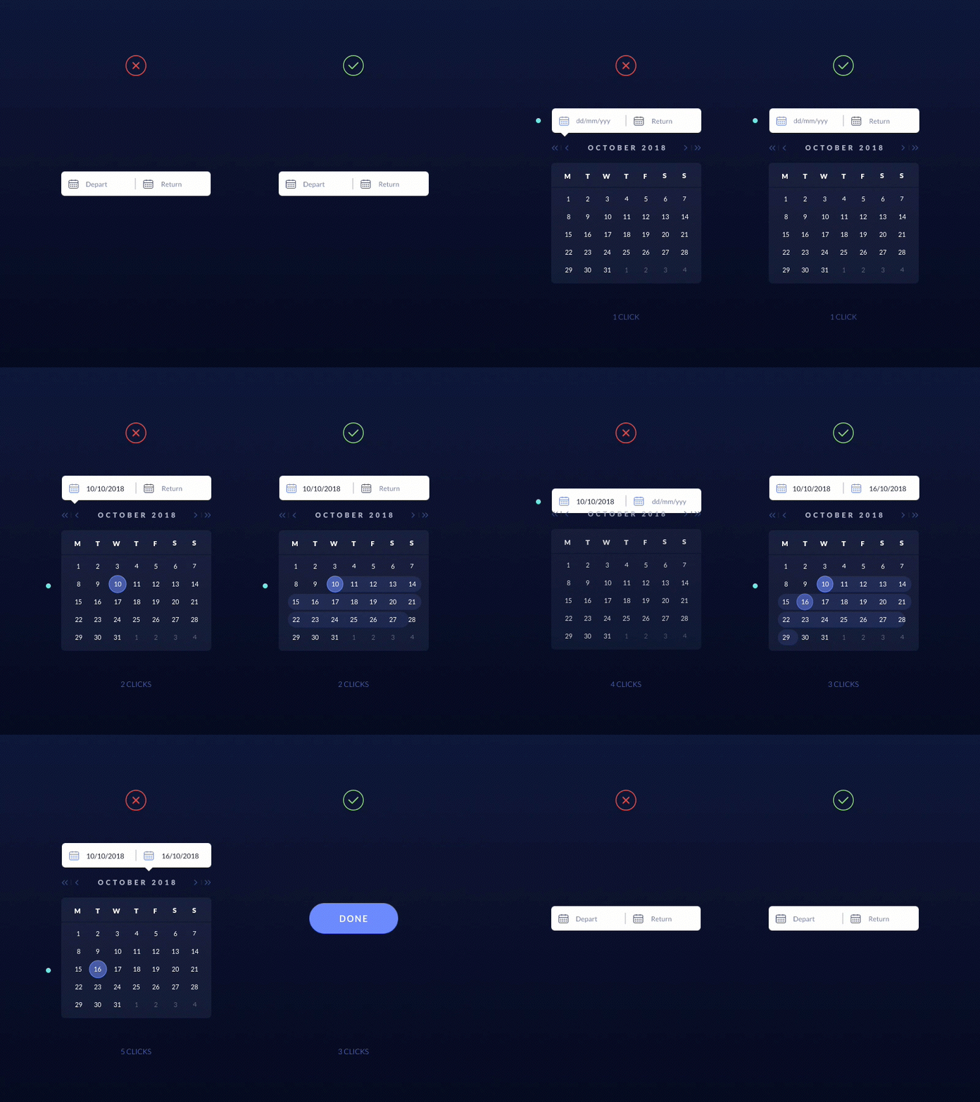
Daily UX - Datepicker
Today I start my own challenge: Daily UX.
It's true that UX and UI are different disciplines, but none would exist without the other. That's why I want to share with you some examples of bad usability and their solutions.
Daily UX #1: The Datepicker. Allow your user to choose dates only in 3 clicks. ;)
Hope you like it! :)
Find me in other RRSS like:
More by Alba Fernández View profile
Like
