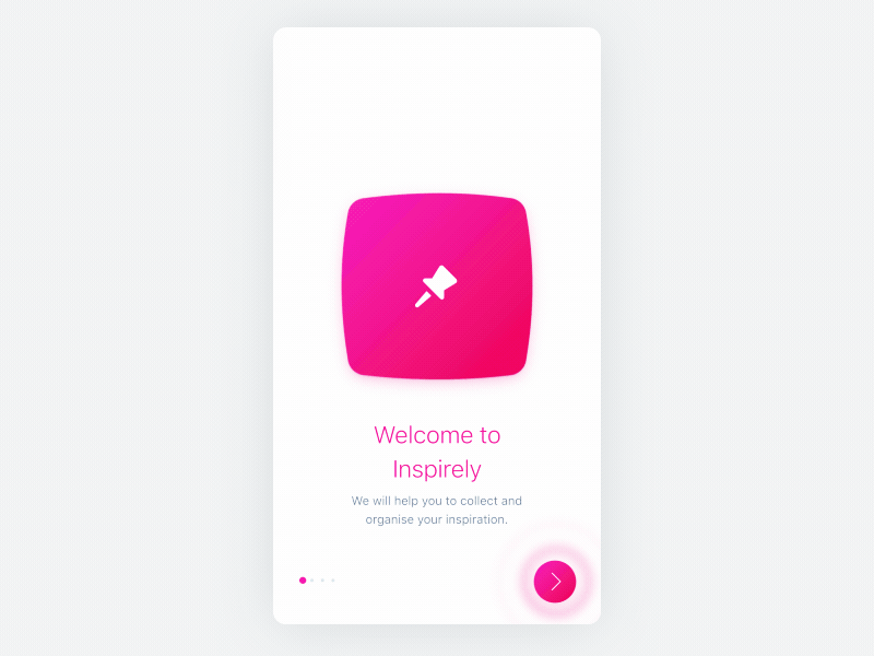
Onboarding Animation
Onboarding(s) should be short.
Over last few days, I have been exploring ways how to create simple yet effective onboarding.
One of the huge challenges was to keep the motion intuitive and simple. I end-up with subtle motion and a small amount of explanatory text per screen.
It will definitely need some minor tweaks but so far I am happy with the results. What do you think?
________
🔥 My Design Tips / Hacks – Instagram
More by Luboš Volkov View profile
Like


