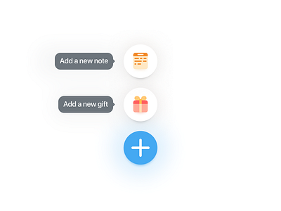
Vriends — Add note or gift
Since we wanted to keep the UI as simple and clean as possible, we decided to use a simple + button in the lower left corner. Clicking this button would show the two options shown in the dribbble shot.
Inspiration for this type of menu came from using Things as my todo app on my iPhone.
More by Jeroen View profile
Like
