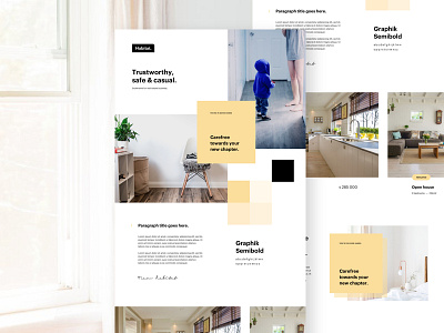
Styleframe
'Sup guys
Trying out a somewhat other post then the stuff that i usually post. Here you guys see a styleframe, this is not a webdesign or something that is going to be used in this format.
We are working on this project at the agency for a real estate firm that's looking to rebrand. We first did a complete strategy workshop with the client where a lot of good things came out of. Some of the keywords for the firm that came out of the session are: Trustworhty, safe & casual.
With the styleframe we try to bridge the gap between strategy and design. This way we can show the client a couple of visual directions before we have to work hours/days on the branding & website. This way the client can tell us up front what he likes and we can tell the client why for instance the right spacing and usage of these kind of images make the brand more trustworthy or safe.
In the styleframe we cover color, typography, the feeling it has to provoce, photography, graphic effects, ...
Long story short, we create these styleframes to bridge the gap between strategy and design so we and the client are faster synced on what we want out of the project.
Let me know if you guys like these kind of posts. If so, i'll try to post more things where i show soms steps out of my process.
Have a great week guys! Peace ✌️
——————————————————
Want to learn design and/or animation?
Check out my classes on Skillshare.
Use the links below and get 2 months Skillshare premium for free!
Design class: http://skl.sh/2h4JrWa
Animation class: https://skl.sh/2D8StYQ
Thanks a ton to everyone that has checked out the classes or has supported me in the last years, you guys are the best!

