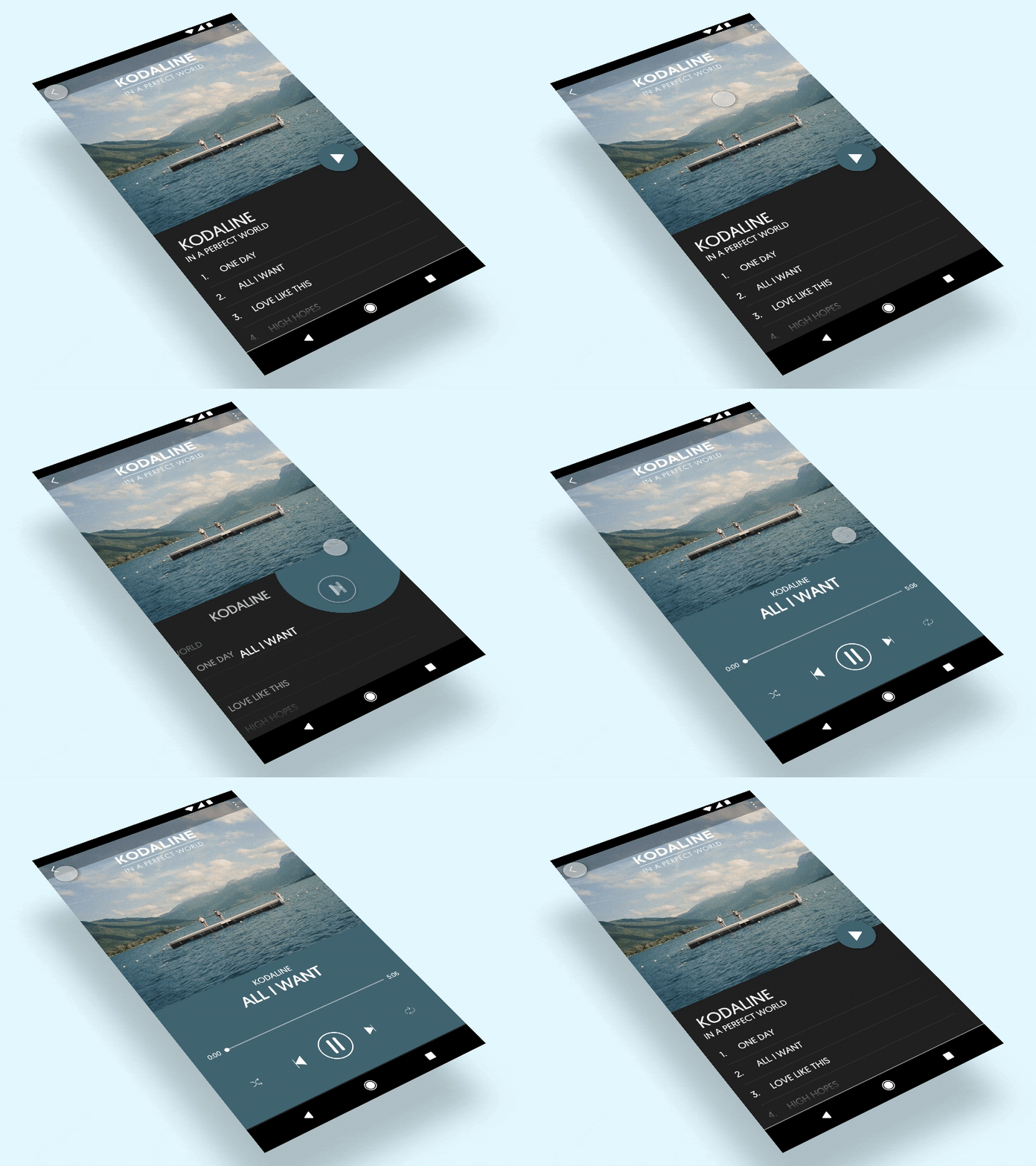
Android Music Player
I've been doing a lot of work lately around animation and trying to improve my skills. It's not something that is primarily featured in my day-to-day job at the moment, but is really something I want to add to my repertoire as I feel it adds so much in getting ideas across to other designers and developers, as well as really bring designs to life. The animation here was done using Flinto, which took a bit of time to get used to, but is quite intuitive once you spend a bit of time with it. However, I'm also spending some time playing around in After Effects to see if its worth the seemingly steeper learning curve, for a potentially more powerful and customisable tool.
This Music Player concept is based around Material Design. As a primary Android user myself, I really love where Google is taking Material Design and the paper-like feel it brings to everything from layout to the movement of various components on screen.
The view here is based around an album view, and I wanted as seamless a transition as possible between choosing a song, and the playing of music itself.
The branding here is primarily dark themed, a step away from some of my previous work, as well as the play button and player background featuring a dark blue colour which is taken from the album art. The idea here is for the player dynamically changing colour depending on certain elements of the album art above it, to merge the two.
Thanks for reading, hope you enjoy!
The initial wireframes and some of my more behind-the-scenes thinking can be found on my Instagram
Be sure to follow me on Social Media:
Instagram | Behance | Medium


