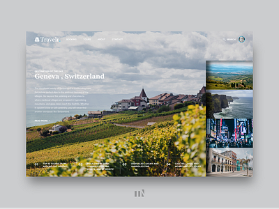
Travel to Geneva Switzerland
I've always wondered why travel website concepts didn't use a vertical selector to transition between images instead of a horizontal carousel or a hidden one. Looking at this concept, the reason is simple: the other pictures are kind of distracting.
Much like portfolio websites, travel websites rely on large high-quality images of locations to intrigue their visitors. If a user has many images to look at, they have to decide which one to focus on. The other images draw attention away from the primary focus, the background image, body text, and CTA.
But I enjoyed trying it out.
What do you think of the vertical selector?
Leave a comment to tell me what you think.
Press "L" if you like what you see.
More by Tiko Nelson View profile
Like
