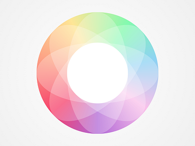
Flux Color Study
The app we created was a high contrast black and white design that had a minimal color range. Nevertheless, we wanted a balanced full spectrum color system for empty state illustrations and key identifiers in the UI. This is what we came up with.
More by Paul Hershey View profile
Like

