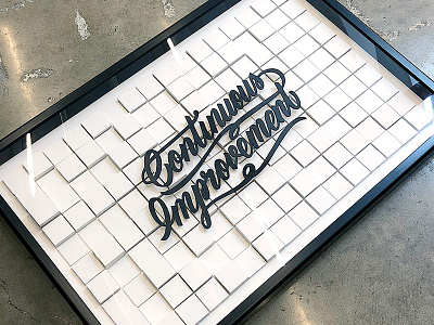
Continuous Improvement
The design team was asked to make posters representing our company values. I went a little overboard on interpreting the definition of a "poster."
I wanted to come up with a way to represent moving from chaos to order. To do this, I wrote a script that calculated a grid of pixels, each with a random depth. The calculation allowed for a wide range of randomness on the left and a narrow range on the right, with the end result being a gradual smoothing (but never perfection) of the grid.
The type floats about .25" above the grid. To reduce the amount of registration I would need to do, I decided the text would need to be made from a single shape. I tried my hand at the lettering but failed miserably. Instead, I hired the talented George Anzaldo to do some custom work, and then had a friend laser cut the result.
The pixels themselves are made out of 2"x2" wood tiles that are .125" and .25" thick, glued together to make the blocks. In addition to calculating the randomness, the script also determined how many of each tile were required to make each block, and calculated the length of each riser to ensure the text was offset evenly.
With math and supplies in hand, I glued tiles and painted cubes during slow website deploys and all-hands meetings over about 5 months.
Lettering by http://kuyageorge.com/

