More Swarm Explorations!
once i get into rabbit holes, i get deep! haha
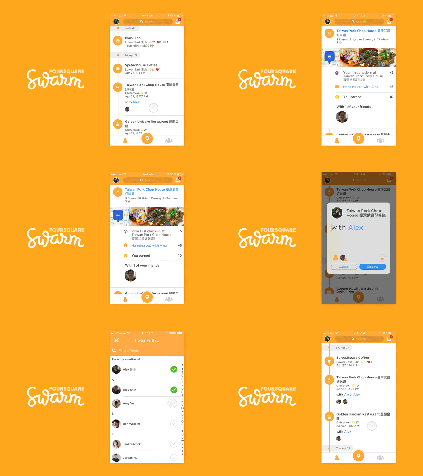
another swarm output (@Foursquare Design) for the sake of app exploring and learning principle. (i still can't say i like it more than aftereffects but i want to do one more animation before i come out with my final verdict)
i thought it'd be cool if upon left swipe, the timeline entry would delete (after a confirmation state pops up, of course)
and visualized here... is the user right swipe! edit mode
as the product currently stands, the edit and delete functions are embedded within a [...]. i can only assume because there was no real estate to surface it on the same level as the timeline itself. the solution i animated resolves just that.
the user does not need to dig to find ways to edit/delete their timeline. the swipe-item-to-surface-action interaction pattern is common enough among large industry apps (think @Google's inbox app) that it would not be a foreign concept when presented to users
this interaction can also be introduced in onboarding and tutorial states to reinforce the function
