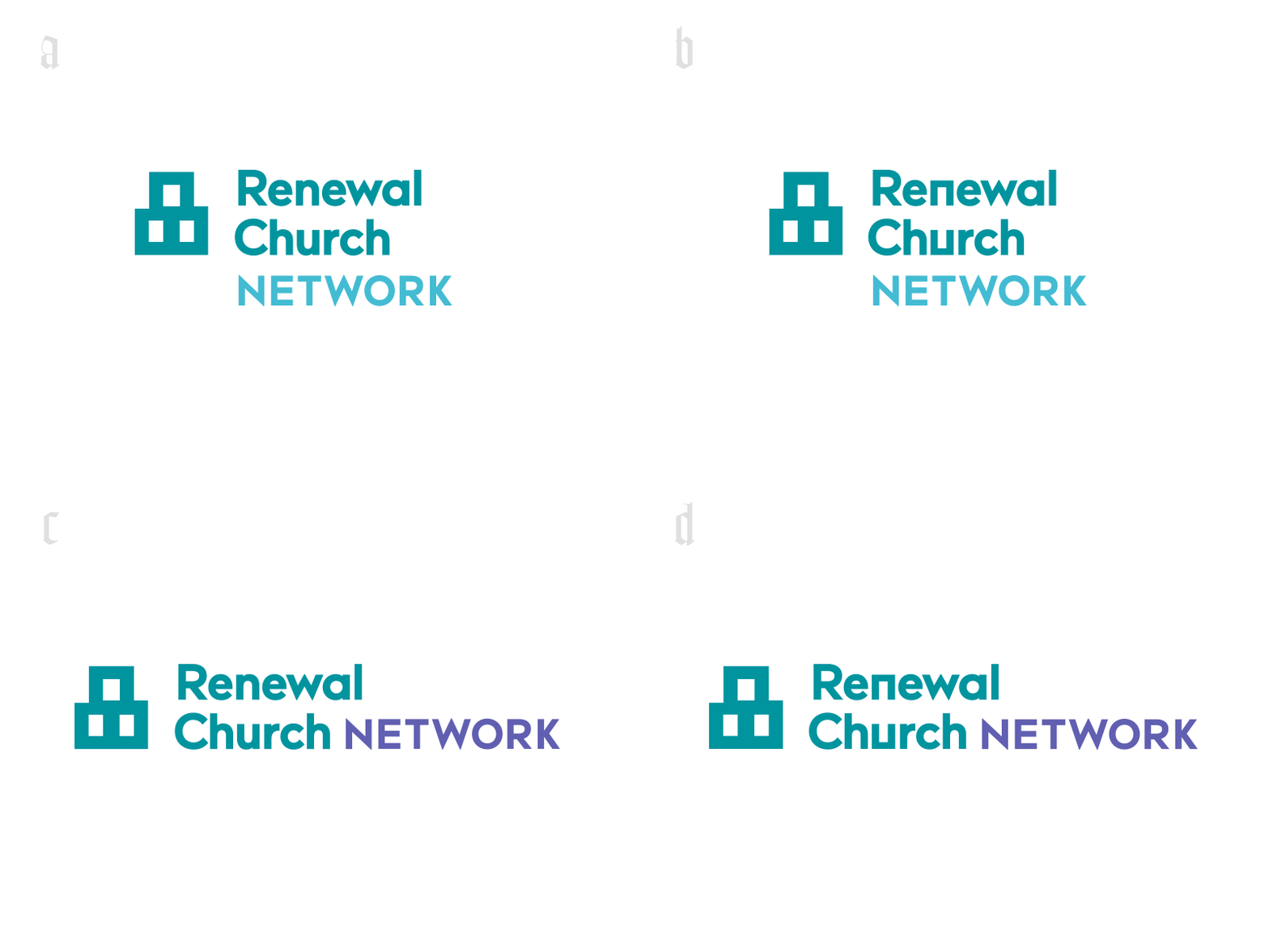
Renewal Logo
a, b, c, or d?
The mark is a house (Renewal is a house church network) and is meant to be:
1. International (not just your typical American suburban home, represents urban high-rise and other styles of architecture, but still has that house feel)
2. Organic (representing the nature of house churches)
3. Historical (the form echoes what some of the first house churches could have looked like)
Bonus:
4. The mark can also be thought of as an abstract representation of the Trinity (ancient Christian view of God the Father, Jesus the Son, and the Holy Spirit being distinct and one at the same time)
More by David Yeiser View profile
Like

