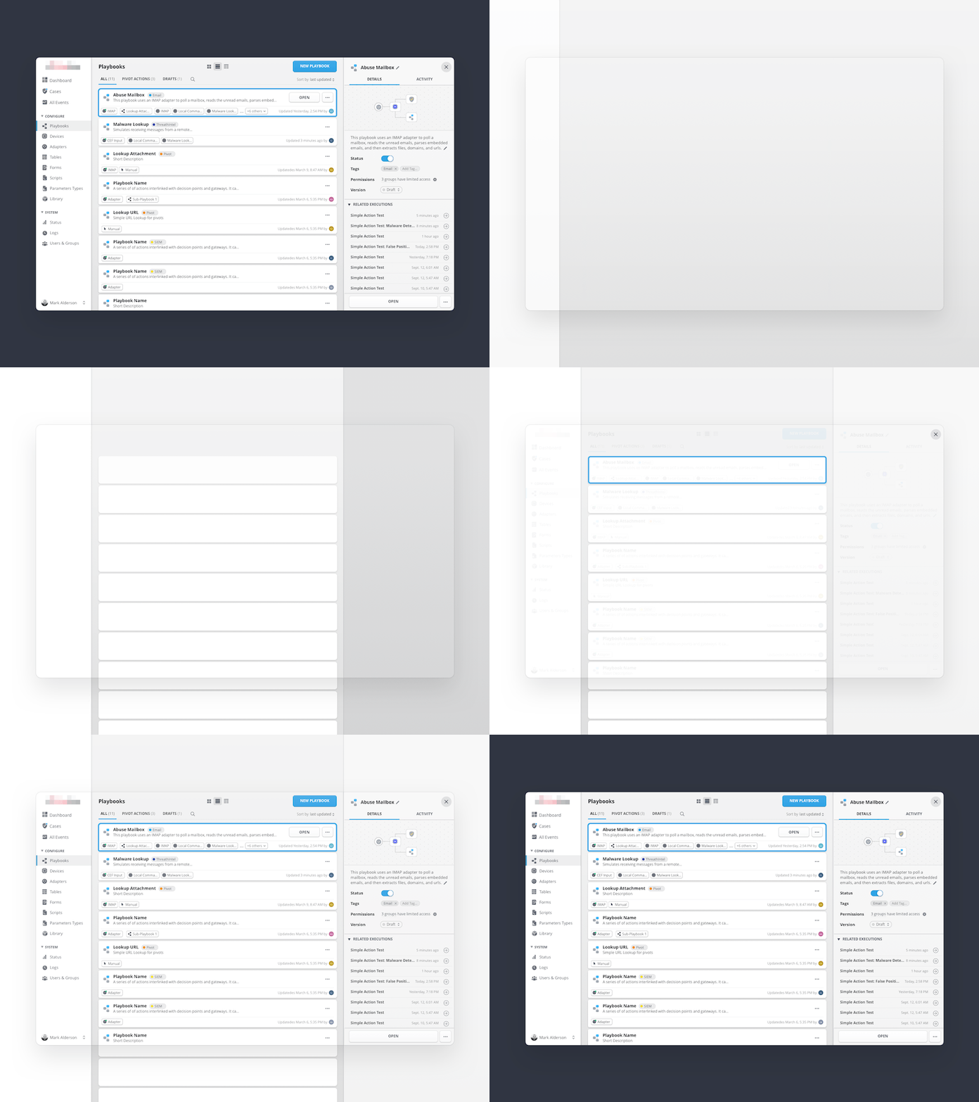
Master–Detail Interface™ layout construction
I had to reinterpret the classic Master–Detail Interface to manage the app's different objects.
Here is the construction of the layout, showcasing the default list which can be switched to cards or to a tighter table. The panels are resizable to take full advantage of the security analyst's usual multiple wide-screen displays.
More by Tristan L'Abbé View profile
Like
