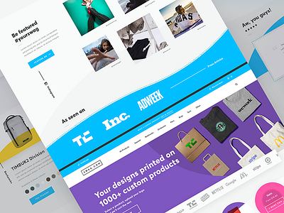
Swag.com NEW Homepage
It's been a few years since the first version of Swag hit the big ol' internet. Exciting things are afoot for them, so an update is totally deserved. It's still a work in progress.
Added in new brand detail. The dashed box was originally used as a motif in the brand guideline so I've pulled it out. In addition, using the extended colour palette in pops here and there gives it a bit more interest. The navigation is the biggest improvement, as it gives you direct access to product categories. We've got interaction ideas, and these will (hopefully) be fulfilled in development!
More by Rosie View profile
Like


