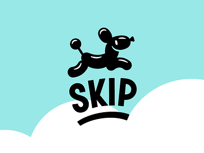
Skip checkout app - logo redesign
Waiting for good things is all fine and well, but not waiting is better. The team at Skip gets this. They made a self-checkout app so you can skip the lines at grocery stores, gas station marts, and other retail locations. You scan items as you go through the store (the app even has store maps to help you find your La Croix STAT), checkout through the app, then pass the sheeple in the checkout lines while laughing maniacly... or some ieration of that. We were honored to help the Skip team re-brand their identity system and illustration set before they launched across hundreds of new stores. Our inspiration? We needed to channel the magic, ease and tinge of mischief involved in checking yourself out and skipping the cashier line. The old logo (see second photo attached), was two overlapping triangles, which read more as an audio app than store checkout app. Plus, the mark lacked personality and fun. The new logo mark has those things out the ears, thanks to a bouncy dog named Skippy and custom type inspired by old hand-painted grocery store signage. Skippy and his illustrated friends will be incorporated into the website and app to show you how to get the most out of the app. Checkout the full brand identity redesign project at the link in our profile! We'll be posting more shots from the project throughout the coming week. Download the app at www.goskip.com . Huge thanks to @Dustin Locke for inviting us to work on this project. The website and app design are his.

