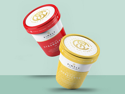
Simply Ice Cream Redesign
A reimagining and redesign of local Kent based luxury ice cream producer 'Simply Ice Cream'.
The new design features a simplified look with clean and clear typography and touches of gold to add that luxury feel. Each one has a pattern created to represent the flavour inside. The redesign of the logo introduces a monogram and features a halo for the dot of the 'i' to reference the heavenly flavours!
More by John Vingoe View profile
Like


