Museo e Certosa di San Martino
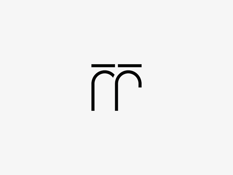
Logo - I designed a logo inspired by the many arches in the structure which tells the story of a place that can be seen anywhere in the city and just because of its presence, makes us always feel at home. From their union I got the letter M of Museum and Martino.
A symbol that can and must work even if separated from the lettering, the goal is to achieve a dynamic identity capable of summoning the observer to immediate calling to the Museum.The brand combines tradition and modernity, using two fonts: Montserrat for 95% of the lettering and Didot for the letter & expressing the concept of bonding fully.
Complete Project: https://www.behance.net/gallery/56171861/Certosa-di-San-Martino