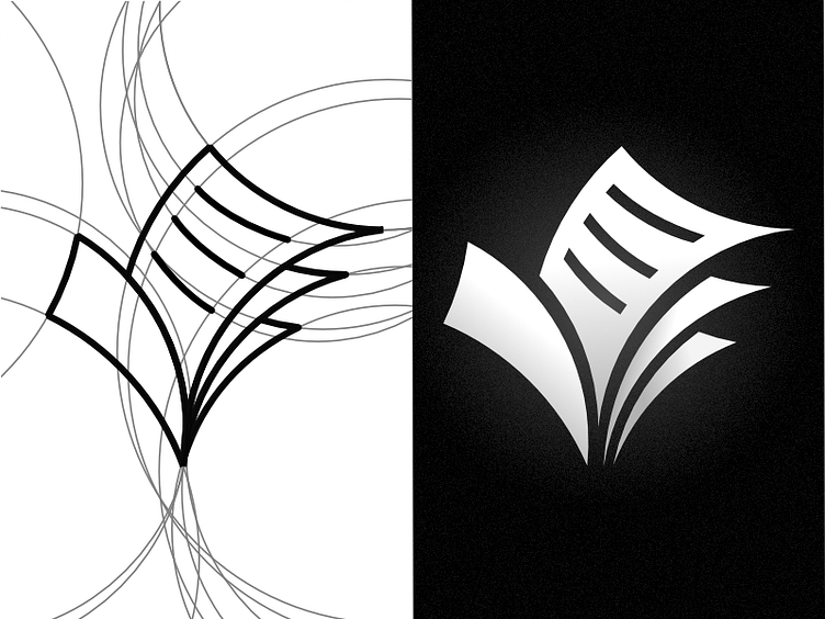
A More Than Okay Logo
When I decided to re-use an old website for another project, I wanted to make a custom logo for it. This logo integrates a checkmark with sheets of paper and is intended to be used for a printing business. I restricted myself to following a sort-of freeform, circle grid to make the logo appear more organic.
More by Ted Klingenberg View profile
Like

