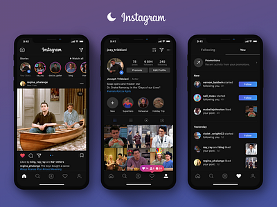
Instagram Dark UI
Instagram Dark UI and small interface changes.
On June 4, Apple introduced iOS 12. Many people expected a dark theme in this version of the OS, but an Apple didn’t do it. But the company introduced the dark mode in macOS Mojave. Now the most popular apps have already made a dark theme. For example: Skype, Twitter, Telegram, Youtube. And I thought about how the Instagram might look in dark mode. This is an additional function rather than a redesign of the App.
There were also some changes in the interface.
For example, the color of likes, notifications, buttons was updated. I made it in the style of a gradient in the colors of Instagram. It looks contemporary and fits into the company's overall style.
How do you feel about the many icons in the top profile panel? In my opinion they clutter the interface. Too many icons on the screen. So I hid 5 icons in one with the exit shutter. I also added a direct link icon. It is not clear why the Instagram have Direct in feed, but not in the profile.
There are also many other minor changes in the interface.
I invite you to my blog:
Instagram - @ajay__design
Telegram - t.me/ajay_design
