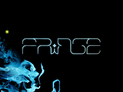
FRINGE
I must have type on the brain today... Another experimental type, this time for one of my favorite TV shows. FRINGE doesn't really have that big of an issue with type right now (who can complain about Helvetica?), but it is somewhat generic in nature when compared to the show. So I decided to try my hand at a custom type that better reflects the show itself.
I decided to try a modern type with an early 80s sci-fi vibe. I let some of the letters bleed into each other to represent some kind of continuum between the multi-verse premise of the show. Also, I decided to include a symbol (the four-point star) that represents an event that sends ripples through the rest of the design (FRINGE fans know what this event is).
More by Matt Kauzlarich View profile
Like
