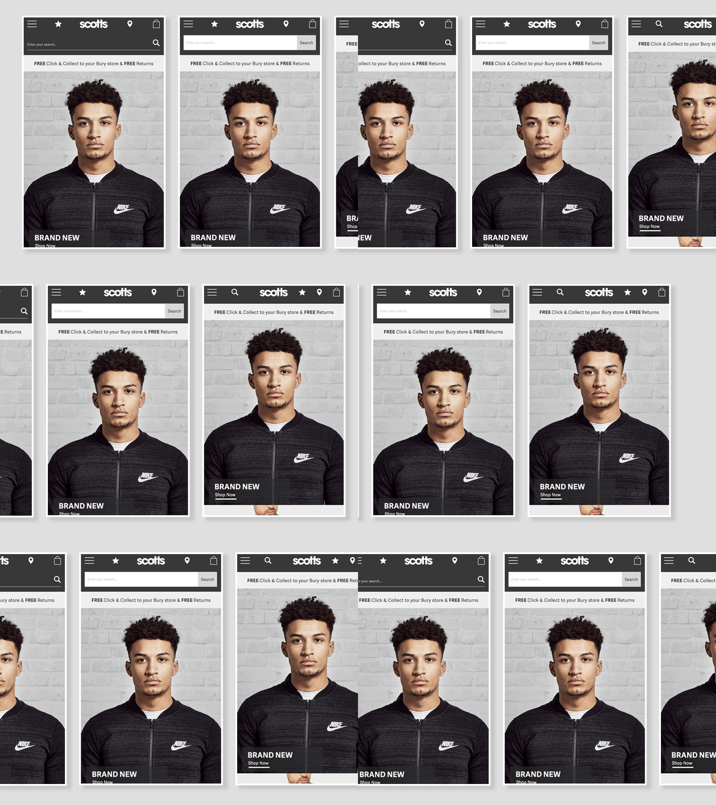
App Search Display
We decided to test an exposed search bar vs the search icon in the top nav. We found that having the search bar exposed encouraged users to interact with the search a lot more and this ultimately provided an increase in conversion. We tested two different iterations of this and the version with a white background and 'search' cta was successful.
More by Chris Goodison View profile
Like
