Rebound of Icons
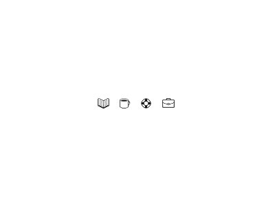
After reviewing, I wanted to try making the book a little clearer by adding some width and an extra stroke of pixels to represent the book cover. On the coffee cup, I made the cup a little shorter to align with the book and worked to get more white around the coffee liquid. For the life preserver, I tried reducing the width and adding a light shadow in the white parts. The shadow is maybe 10% or less opacity. On the briefcase, one of the confusions was the straight line in the middle. The briefcase was looking more like a lunch box. I tried adding a little curve to it. I hope this rebound gives some ideas.
