Infographic
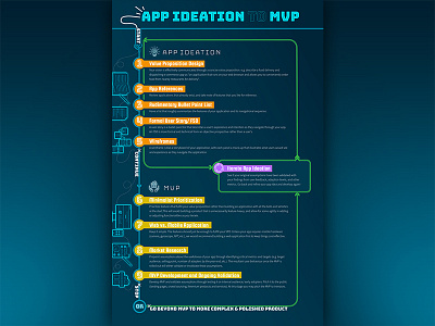
An infographic I worked on with a coworker. I did the design and my coworker wrote the copy. I wanted to do something that looked like fun neon lights -- fun because this is an infographic and neon lights because I associate "ideation" with lightbulbs. All the steps are connected with bright lines to depict neon lights stringed together, while still using colors from our company brand.
The original idea was to make something that looked like a simple timeline; however, the steps are not exactly as simple as a linear one where you start at step 1 and stop at step 9 and that's the end. On the infographic you can see that once you reach step 9, you can either stop there or go back to iterate through steps 1-4 as many times as you want (you only go through steps 5-9 once). This was a challenge for me since it was very easy to confuse the subsequent iterations (the green arrows) with the first (blue arrows). I had to really play around with the graphics to make sure that visually, viewers can easily make the connection between the headers and the step numbers and not get lost with the green arrows as they follow the steps.
