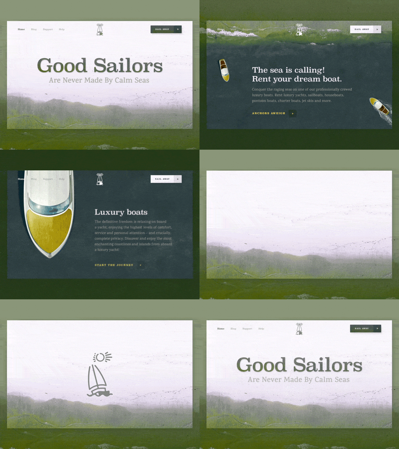
Design Experiment: ‘Good Sailors’ Boat Rental Company Website
Sup friends?
I’m good, hope you’re doing great too. Actually, I was in the right mood for some experiments yesterday which resulted in the shot you see above. This is a landing page for a luxury boat rental company where you can not only rent an exquisite boat, but also a highly professional and skilled sailing crew with years of experience to help you conquer the raging seas. So anchors aweigh!
Goals Coming up with some modern, unconventional design experimenting a bit with page transitions.
Approach In order to come up with extraordinary design and provide seamless user experience I decided to use awesome visuals that reflect the company’s nature and connect them with some cool page transitions. I thought that parallax scrolling effect is just what the doctor ordered in this case, because if used wisely this effect can become a cherry on the cake, making your design look really catchy and stylish.
Results What we ended up with is a slick and elegant design which pretty much differs from what we’re used to seeing on various rental websites. Wonder what you think of this lil’ experiment of mine. Share your thoughts, buddies. I’m all ears!
P.S. Many thanks to @Igor Pavlinski for helping me with the animation part.
Press "L" to show some love!
ᗈ Join our Newsletter! ᗈ Website ᗈ TheGrid ᗈ Spotify ᗈ Twitter ᗈ Medium ᗈ Facebook ᗈ Instagram


