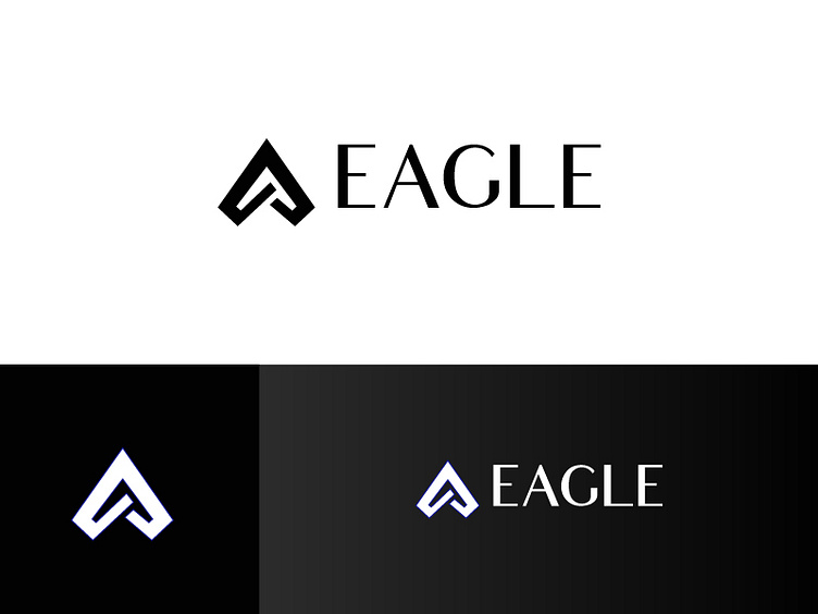
Eagle logo
Keyword: ADVON - Short for ADVanced EchelON is a military term for personnel positioned first to ensure to safety and success.
---------------------------------------------------------------------
I start by taking advantage of the shape of the letter “A” that has a pyramidal style. The wider base is communicating a solid and well-established company. I also made the diagonals square to add the meaning of advon in the logo, visually can be seen as an eagle/wing. The thinner upper part is to convey speed. The direction of the thinner part (up) is communicating the forward motion, rise, success! The final part of the "A" in the middle is for add the security concept and close the logo. The final "crossed legs" give strength to the logo working together with the security concept. I used this dark blue/ black palette to convey a modern and high-end company.
