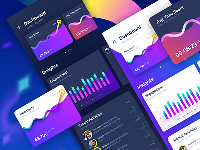
Dashboard 2.4 Wip
Hey Guys! You must have seen some of my earlier dashboard designs. Here is another experiment I’m trying to show the data using in both light and dark theme. Hope you like it.
Show some love by pressing the L key on desktop, or tap on the 💖 like button, if you’re on mobile device. 🙏🏻
If you have more ideas, just share using the comment box down 👇🏻 here
Would you like to be part of our biggest UX Discord community? Join GSIUXD on Discord now. Thank you so much for your 💖
More by Abinash Mohanty View profile
Like


