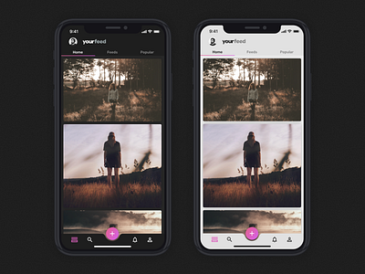
Day 14 - New Home Screen
I am almost half way trough the 30 days challenge to design an app. I have been designing and posting new screens everyday and behind the scenes I am also redisigning what I did in previous days. That is one of the reasons for the lack of animations, I'm saving that for the final version of the app!
This is the version 5 of the home screen, and I am posting it 10 days later than the first version and I'm still not sure if I should go for light or dark interface, which one would you prefer?
Also, I added a navigation bar in the bottom with all the thing I need to navigate trough the app! What do you think about that?
More by Miguel Freitas View profile
Like
