Logo Design WALL
First proposal WALL Logo Design.
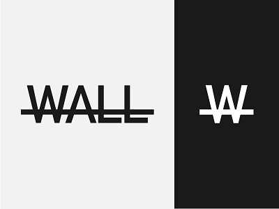
WALL is an app that wants to tell the story of Berlin in the period of the division between east and west by the Berlin Wall.
Logo concept represents this division in a minimal way (as Germany has taught us to do), with the logotype being broken. Moreover, in the use of the single emblem (the crossed W), it also seems to resemble the shape of the barbed wire, another emblematic symbol, used to underline a ferocious division of the city.
Typeface is DIN. This type is many used in Germany.
Let me know what do you think about this proposal in the comments.
Social Links:
Facebook | Instagram | Behance | Twitter | Linkedin | Pinterest
More by Antonio Calvino View profile
Services by Antonio Calvino
Like
