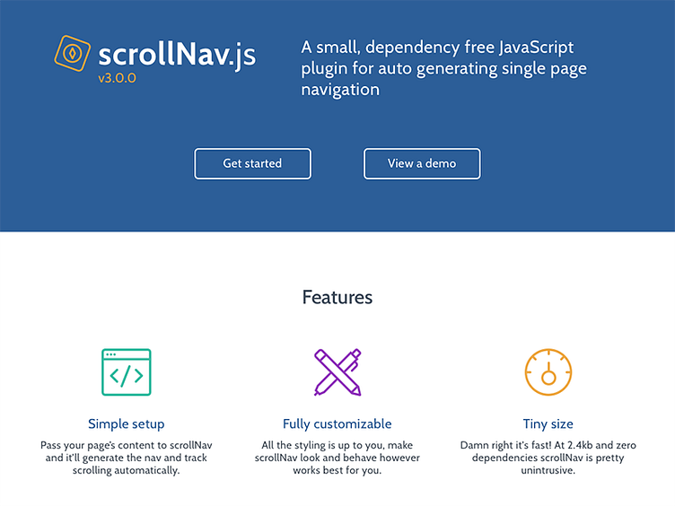
scrollNav Home Mockup
The guide pages are in good shape so I circled back to the homepage. Trying to introduce a bit more color to create some contrast while keeping the overall feel of the site clean. Nothing revolutionary, but I'm definitely enjoying it.
More by Jimmy Wilson View profile
Like

