Mobile POS Hardware - Email Design
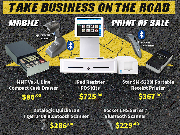
Latest email design. It is the season of festivals, tradeshows, pop-up markets and more on the road goodness. Usually, an email like this isn't going to result in as high of sales, primarily because mobile and Bluetooth hardware are more expensive.
So whats going on... a very obvious and unveiled LOOK AT ME. Using the triangle shape, combined with symmetry, combined with the yellow/black combination to make people look. If someone is looking for mobile they won't be able to miss this. It is also on the homepage of the e-commerce site.
A secondary level of look-at-me is that these are in contrast to the brand of the site itself. I usually stick to white, blue, orange, green but I really wanted this to grab attention and stand out as special.
I did the photography and edits on the iPad Register POS Kit here and happily went over the top with seamless textures on the road.
Thanks for getting to the bottom <3 Have a happy design day.
