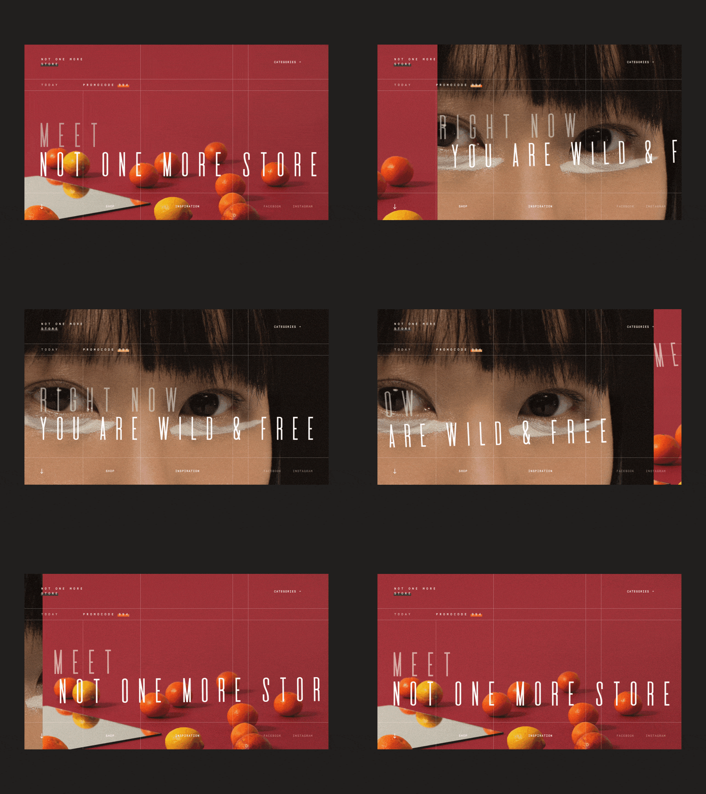
Not One More Store Homepage Alternative Animation
Friday friends,
Glad to share with you an alternative animated version of the homepage created for a very progressive e-commerce platform with a truly rad name "Not One More Store". The main idea of the website is to speak to its name and make sure it appeals to visitors' eyes from the very first glance. The animation is done to further enhance the overall WOW Effect.
Really eager to hear your thoughts and comments!
Enjoy your weekend :)
Cheers!
Press "L" to appreciate it
More by Synchronized View profile
Like

