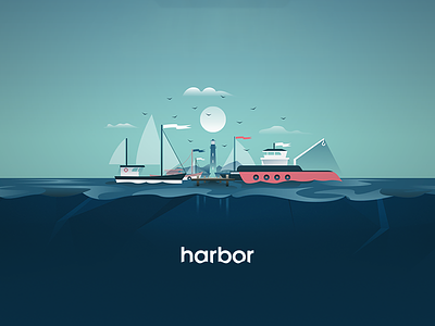
Harbor Illustration
We had the opportunity to work with Facebook to establish a brand identity and design for a revolutionary new platform built for their security team.
Harbor was selected as the theme, playing into the idea of calmness and as a metaphor for the safe space we wanted to create.
The illustrations leveraged soft line work, light gradients, and a restrained color palate to create a sense of calm.
Check out our case study to learn more.
More by Termini Design View profile
Services by Termini Design
Like

