News Feed Design for a Young Journalist Platform
Hey folks!
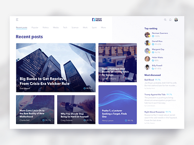
How’s your week? We’ve got lots of work here at Zajno, so many projects, so much to do. Yet I’ll always find time to share some designs with you guys! What you see above is the first screen of the news feed page design I created for a new journalist platform created by youth for youth.
Goals
As the product is mainly targeted at young people, our task was to come up with the kind of design that could appeal to this target group, and make it also stylish and intuitive.
Approach
As the key objective of this page is telling users the latest and most important news in different fields, I put the accent on the news posts for they are the main elements on the page. The second most important element on the screen is the ‘Top Ranking’ block where users will see popular young journalists because one the platform’s goal is to help young talents be noticed and make it big.
Results
We ended up with a clean and stylish website design, good “white space” utilization and attention to detail which allow to attract the target audience in a more efficient way.
Don’t forget to follow Zajno on social media and feel free to drop us a line:
Website | TheGrid | Twitter | Instagram | Medium

