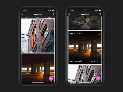
Day 10 - Popular Feed
One of the things I disliked from the home feed I made at the start of this challenge was the big amount of space required for all the text and icons on screen, comparing to the space pictures were using.
So, now, when working on the popular feed I decided to approach thing differently, I wanted to achieve the cleanest screen possible, focusing on the pictures. Here is how I achieved that:
- When scrolling the feed, show only the pictures, no extra info;
- When tapping once, show some basic info about that picture (right screen);
- When double tapping, like the photo (people are used to that already, so why not?);
- Tap and hold to open picture page.
Recently I've been changing from a dark background to a lighter one, how do you think it is going?
