Comments Design
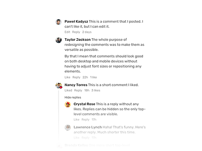
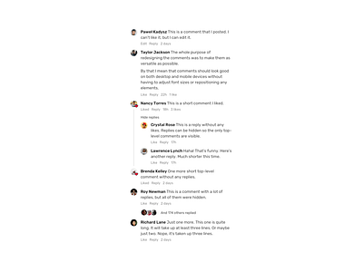
I spent almost two days working only on comments. The purpose of the redesign was to use the same style for both photo comments (narrow sidebar) as well as forum comments (full width column).
They also look really good on mobile devices without having to change font-size or repositioning any of the elements.
I'm happy.
More by Pawel Kadysz View profile
Like

