KPN Dashboard
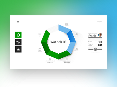
A few years ago I worked on a new dashboard interface concept for KPN while working at Mirabeau. This has always been one of my favourite designs I did while working there as a Senior UX Designer. The idea was to have all your digital KPN Products in one single overview while maintaining a simplistic UI.
Don't forget to see some of the other real pixel screens of the same concept. (Attachments!)
© Mirabeau & KPN
More by Ricardo de Zoete View profile
Like


