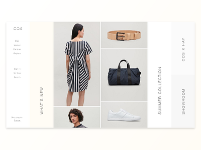
COS Landing page Redesign
I always liked COS. A minimalistic brand, with high quality.
I challenged myself on a 1-hour redesign session, here is the result. A minimalist landing page, made with a golden cannon grid. Maybe I'll animate this one when i've some time.
"L" is you like it ! :)
More by Johanny Grenier View profile
Like
