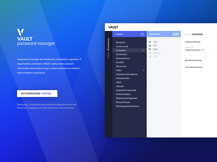
Homepage draft
We're rethinking the design and content of our homepage. We'd like to go for less text, but a better visualization on how the app works. And only one button with 'get started for free'.
What do you guys think? An improvement? Or not at all? Current homepage can be found at https://hypervault.co.
More by Glenn Van Croonenborch View profile
Like
