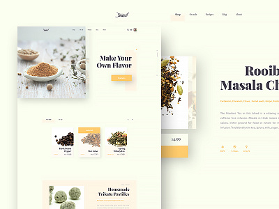
Harissa Spice Store
Hey there! This is a homepage redesign of my number one spice supply store here in Croatia - Harissa, along with my favorite homemade tea in the product page.
Just to be clear this is just for practice, so I went nuts and had fun with right text align, drop shadows went soft, color picker was picking some pastel colors, everything to make a little bit of relaxing mood.
So, is this color pallete a little strange for your good taste? Do some elements remind you of a cookbook layout?
What do you guys think? Glad to take it all in... :)
Press ♥ for l’amour and take it easy!
--
Looking to do something similar? Get in touch!
More by Kreativa Studio View profile
Like


