mBank redesign
There is a bank in Poland called mbank. They have recently introduced a redesigned version of their transaction online banking panel. I didn't like their redesigned app, I even more do not appreciate the panel.
This is how it used to look like: http://ocdn.eu/images/pulscms/OTQ7MDA_/a0abbbd6d258e6094f6da7390507dee1.jpeg
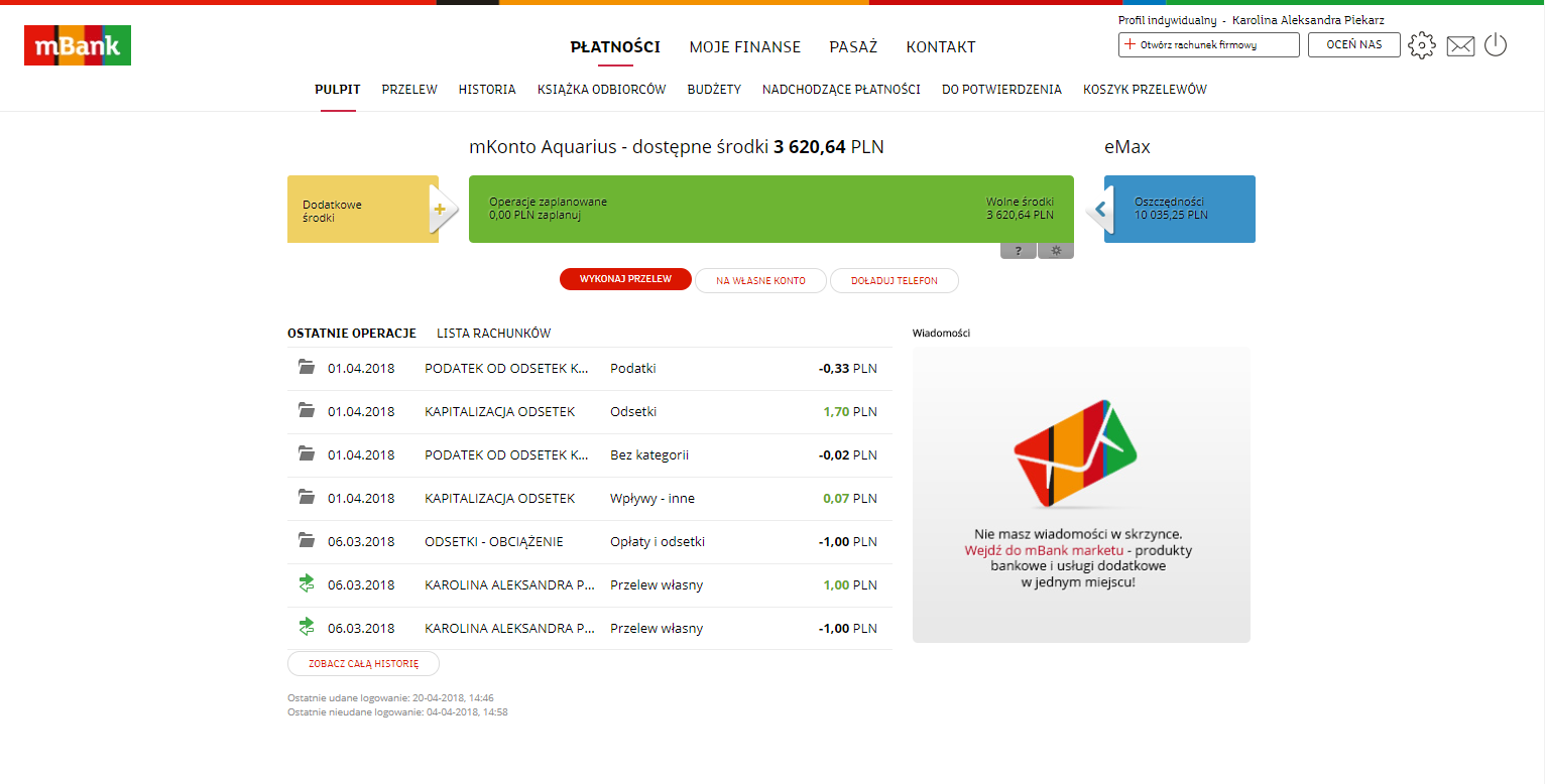
And how the new version looks:
https://www.mbank.pl/images/blog/transition-indywidualne-big.png
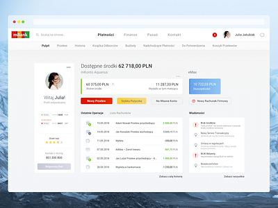
I am not saying that my version is perfect. I tried to keep it as similiar in terms of layout as possible but introducing some features which would be very useful for me, and also giving less or more priority to some others. The thing that annoys me most in the new design is the lack of blocks or some kind of layout. Navigating through it is a nightmare. So I share something more modern than the old version that I still would be happy to use - this means no fancy graphs, no cards visualizations, a bank but with a touch.
Tell me what you think.
Have a great week!
