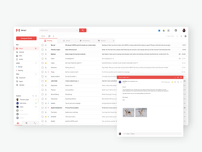
Gmail Redesign
Hello,
Over at the Uplabs is currently active challenge for Gmail redesign so this is my submission.
I've decided to keep the white look and things I personally like about the current design, but redesigned the aspects which i believe are lacking. For the purpose of this challenge I've played around a bit with opened emails as overlays, but I'm still not sure how i feel about it. Further testing is required :D
Make sure to check out the attachments and tell me what you think :)
More by Tadej Bolcevic View profile
Like


